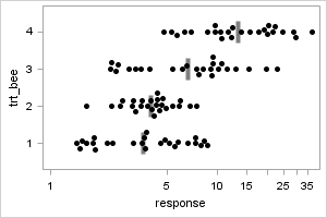
Static plot with non-random jittering to reduce over-plotting in dense data sets
Introduction
This project presents graphical displays of grouped data distributions using beeswarm plots.
Examples are shown using both SAS and R.
Each example includes complete code for generating the target graph.
The SAS examples are based on Shane Rosanbalm's SESUG 2014
presentation.
Contact graphics@rhoworld.com with any questions.
Examples
Overview
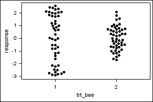
The beeswarm plot is a distant cousin of the Scatter Plot. A continuous variable is displayed on the vertical axis and a categorical variable is displayed on the horizontal axis.
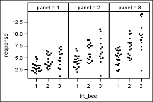
 The traditional form of this plot is a strip plot, which vertically aligns all the points in a group, often resulting in a significant number of data points overlaying one another.
 A random jitter is sometimes employed to reduce these overlays, but it does not guarantee that they will be eliminated entirely. Moreover, many points are moved unnecessarily when using this method.
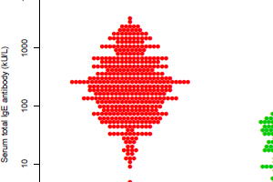
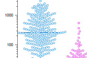
 The beeswarm plot uses a computational algorithm to move data points the minimum distance necessary to avoid overlays with other data points within the same group.
Summary
Refer to the examples for sample code to create and customize beeswarm plots in SAS and R.
